CodaBool
My First Website
This is a live project which can be visited here
I had not taken a course in web development or coding for that matter but I wanted to learn the skills needed. This website was really a test for those underdeveloped skills which I was learning on the way. Also, this site served to be somewhere to showcase my photography. I had done a couple vacations and luckily had access to a DSLR camera. So, enjoy a quick tour of the photography website. I will walk through the main features and my thoughts looking back.

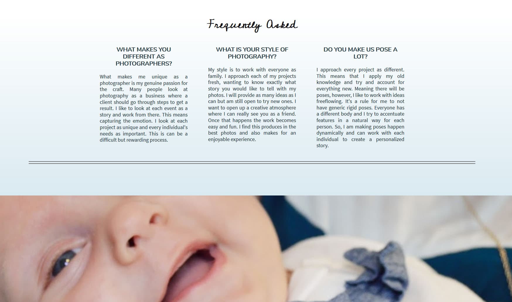
First up I created a logo and had an idea for Ven being the online handle. I secured the domain ven.plus (which I do not own anymore). Going down on the main page there is a photo slideshow with a seamless connection to the navigation bar. No framework was used and it's all written in CSS. This is still an awesome look and holds up after designing many more pages after this one.
Custom logo made in Photoshop
The styling on many of the pages works and makes for a pleasant viewing experience. However, looking at the code and how it was achieved is another story. While I was an amateur when I wrote this site, I think it is worth taking a look at old projects and what I would do different.
Hover Effects and background gradient
Some issues pop out to me as I look back on the code for this. Number one, there is way too many things hard coded. Take a look at the gallery.html page a large eyesore in the code is the use of Google Photos urls which are over 650 character strings.
gallery.html Hardcoded URLs
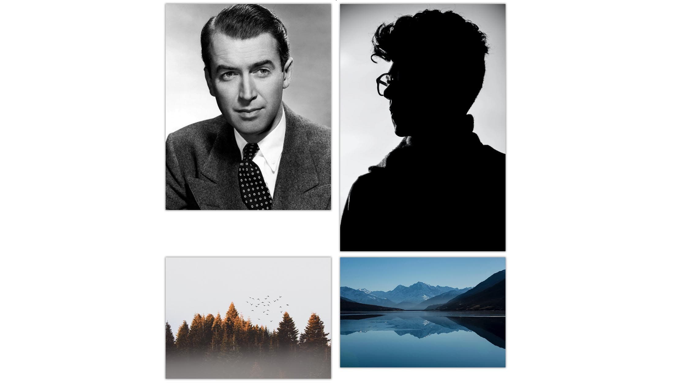
On that same gallery.html page I added classes for the photos and hardcode their position into either a left or right column (that's important). This was the easiest way I found to organize the photos and wanted to keep the JavaScript to a minimal. I was overwhelmed with having to learn a stack of languages. This means the only JavaScript I used was making pictures of a defined class disappear using style.display = "none"
Gallery page
How I wrote it
Like I said I assigned all photos a class, then for each category filter button I would have a function run similar to the one seen below
JavaScript to show only Landscape photos
function revealLandscapes() {
  var elems21 = document.getElementsByClassName('babies');
  for(var i = 0; i < elems21.length; i++) {
    elems21[i].style.display = "none";
  }
  var elems22 = document.getElementsByClassName('couples');
  for(var i = 0; i < elems22.length; i++) {
    elems22[i].style.display = "none";
  }
  var elems23 = document.getElementsByClassName('events');
  for(var i = 0; i < elems23.length; i++) {
    elems23[i].style.display = "none";
  }
  var elems24 = document.getElementsByClassName('portraits');
  for(var i = 0; i < elems24.length; i++) {
    elems24[i].style.display = "none";
  }
  var elems25 = document.getElementsByClassName('landscapes');
  for(var i = 0; i < elems25.length; i++) {
    elems25[i].style.display = "flex";
  }
}
Once ran it takes all photos by their class: Landscapes Portraits Events Couples Babies and overrides its display property. For the other filter buttons a similar function is ran. Then for the reset button I used JQuery to set the display property to display: flex overwriting display: none
jQuery reset button
$(document).ready(function(){
  $( "#all" ).click(function(){
    $(".all").css({"display": "flex"});
  });
});
Looking back
After 5 years looking back at the implementation here the use of classes was correct, they are a nonunique way of manipulating multiple elements. However, creating two columns of pictures through the use of the display property was forced here. The issue becomes obvious when selecting a filter and scrolling all the way to the bottom.
Blank space
How I would write it now
My phobia of frameworks and languages has been overcome and I would definitely build this site using something like React and Bootstrap today. However, I will be doing a solution without React to keep it simple (KISS). I am going to show an original solution in vanilla JavaScript but I will be adding Bootstrap to cut down on writing custom styling.
> writeCode()
To begin a rewrite I would place all the image URLs into a JavaScript Object of arrays for each category I want to filter by. Then I will create an array of the filters. Categories in the filter array will not be shown in the gallery. Placing the image URLs into the JavaScript allows it to be exported from another file and imported to avoid seeing some long 600+ character URL in your workspace.
JS Initialize Variables
const gallery = { children: [ // stores all the gallery image src values
  'url...',
  'url...'
], groups: [
  'url...',
  'url...'
], events: [
  'url...',
  'url...'
], portraits: [
  'url...',
  'url...'
], landscapes: [
  'url...',
  'url...'
] }
var filter = []
// example of a full filter list:
// var filter = ['children', 'groups', 'events', 'portraits', 'landscapes']
Now I use Bootstrap to setup a rows and columns. This could be done all in JavaScript using the map function to dynamically create elements regardless of the total images but creating and assigning classes in JS is tedious and it's easier to just write the HTML.
HTML rows and columns
<div class="container gallery">
  <div class="row">
    <div class="col-6 cont">
      <img src="" id="img-0">
    </div>
    <div class="col-6 cont">
      <img src="" id="img-1">
    </div>
  </div>
  <div class="row">
    <div class="col-6 cont">
      <img src="" id="img-2">
    </div>
    <div class="col-6 cont">
      <img src="" id="img-3">
    </div>
  </div>
  <!-- ... etc ... -->
  <!-- enough rows and columns to fit all images -->
</div>
Lastly before diving into the logic behind the gallery...some styling. This keeps the photos contained within the div tags and looking nice.
CSS
.gallery Img {
  max-width: 100%;
  max-height: 100%;
  margin: 10px 0 10px 0;
  box-shadow: 0 0 6px 1px grey;
}
Alright first I created a way to iterate over the grid by the id of each image tag. Then assign it the next image of the array. For filtering I check if they are supposed to be filtered out with the indexOf method (MDN) which returns the index of a given value within an array. However, I use it for its special property of returning -1 when the value is absent. Here if I find that the filter array contains the category I am currently iterating over I set Img.style.display = 'none' to make the image disappear
JS adding images to grid
function addImages() {
  var position = 0
  for (var category in gallery) {
    if (filters.indexOf(category) === -1) {
      for (const url of gallery[category]) {
        const Img = document.querySelector(`#Img-${position}`)
        Img.src = url
        position++
      }
    }
  }
}
JS hiding images if filtered
function applyFilters() {
  var position = 0
  for (var category in gallery) {
    if (filters.indexOf(category) === -1) {
      for (const url of gallery[category]) {
        const Img = document.querySelector(`#Img-${position}`)
        Img.style.display = "block"
        position++
      }
    }
  }
}
Now if I call applyFilters(), images are added to the page in a nice grid. Take a look

But let's implement filtering decisions. I created checkboxes for allowing the user to filter the images. These have an onchange property which calls the handleChange method. This is passed the event where the information about which select input it was can be discovered. I use the input's id property which I conveniently name the same as what I expect the name of the filters to be. Here I am using the array.splice method (MDN) to remove the filter if the checkbox was unchecked. Otherwise I push the category name onto the active filter array.
JS
function handleChange(event) {
  console.log(event.id)
  if (filters.indexOf(event.id) === -1) {
    filters.push(event.id)
  } else {
    filters.splice(filters.indexOf(event.id), 1)
  }
  resetImgages() // we will this implement next
  applyFilters()
}
Ok, so we can add filters and remove them but none of the images are getting removed. We need a way to remove the src URLs from the image tags if they are from categories in the filter array. I will take the easier but more reckless route of setting all images in the gallery to blank src URLs and then adding back the ones which are not filtered.
Reset image tags
function resetImgages() {
  for (let i = 0; i < 12; i++) {
    const Img = document.querySelector(`#Img-${i}`)
    Img.style.display = "none"
  }
}
That's it, a working gallery with filtering. Take a look.
If I wanted to improve this more I would add a delay and fade the images out before getting removed for a less jarring experience of filtering. You can checkout my codepen showcasing everything I've shown below.
The rest
Another issue I would fix on a reconstruct would be the use of raw images. Google Photos stores with minimal compression. I use these minimally compressed photos links and this can lead to a massive chunk size while visiting. While outsourcing the photo hosting was clever this is a issue which I would want to fix if I designed it today. I would fix this one by compressing the photos, possibly cropping as well and storing them at a photo hosting service. Worst case just storing them into a assets folder to achieve a faster page load and for cleaner image src urls in the code.
I am impressed at my use at PHP to handle an emailing feature. At the end of the page and on a contact page there is a form with a send button. This makes use of a action_page.php to mail and redirect to a thank_you.html page. Considering I was avoiding any lines of JS I am surprised to remember I made something like this. The PHP file will setup 14 variables for the subject and other parts formatted cleanly and even sends a copy to the client.
Another aspect which I felt was decently executed was the use of flex. I put almost everything into a flex container. The word flex shows up 138 times in the 10 files. Columns stack and the page works well when resized. I even was able to make use of @media in the CSS files. In addition there are external fonts applied to the page. I developed this page in 2015 and I feel like I did a decent job from what I knew at the time. Coding is never perfect the first try. You build tear down and build again. Each time a little better.


